
A blank wall holds more potential than most people realize. With the right arrangement of frames and artwork, it can become the most expressive corner of a home — a visual story that reflects personality, memory, and style. The appeal is in the versatility: gallery-style displays work in almost any space, from narrow hallways to expansive living rooms, without requiring a professional designer or a generous budget.
Understanding the Basics of Layout
Whether you’re refreshing a living room or a hallway, mastering gallery walls starts with understanding a handful of key layout strategies. This guide walks through proven steps for planning, arranging, and hanging displays that feel intentional and balanced — drawing on design principles that take the trial-and-error frustration out of the process.
Every successful arrangement rests on four core elements: frame variety, artwork selection, spacing, and overall scale. Keeping 2–3 inches between pieces creates visual cohesion without making the display feel either cramped or scattered. The most important mindset shift, though, is this: treat the entire arrangement as a single unified artwork rather than a collection of separate pieces. Viewed as a whole, the display takes on a sense of intention and balance that no cluster of isolated frames can achieve on its own.
Choosing the Right Location and Scale
Before driving a single nail, take time to assess the space. Hanging artwork so the center sits approximately 57–60 inches from the floor — roughly eye level for most adults — keeps displays from floating too high or sitting awkwardly low.
Room function should guide the shape of the layout: hallways naturally lend themselves to linear, horizontal arrangements, while living rooms can accommodate larger, more dynamic configurations. The “furniture horizon” rule is particularly useful here — aligning a display to complement a nearby sofa or console table visually anchors it to the room rather than leaving it stranded on the wall. As a general guideline, aim to fill 60–75% of the available wall space to strike the right balance between visual impact and breathing room.
Planning Techniques That Eliminate Guesswork
Lay It Out on the Floor First
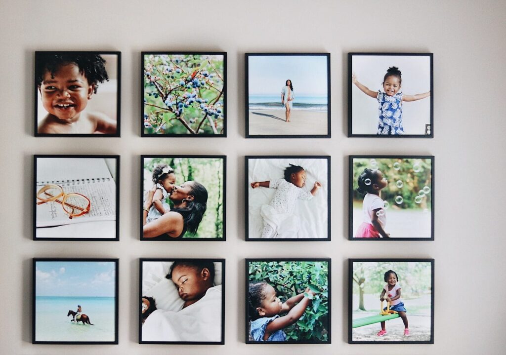
Start by arranging all the frames on the floor. Place the largest or most visually dominant piece at the center, then build outward, alternating sizes and orientations — mixing horizontal and vertical frames generates a sense of dynamic energy. The Rule of Odds is worth keeping in mind: groupings of 3, 5, or 7 pieces tend to feel more natural to the eye than even-numbered arrangements.
Use the Paper Template Method
Trace each frame onto kraft paper, cut out the shapes, and tape them to the wall with painter’s tape. This approach gives complete freedom to adjust spacing, alignment, and overall composition before committing to any holes. A bubble level or laser level keeps rows straight. Testing a nine-piece eclectic arrangement this way, for instance, often reveals imbalances that are simple to correct on paper — but far more disruptive to fix after everything is hung.
Popular Layout Styles
Symmetrical grids are a strong starting point for beginners — uniform frames with consistent spacing deliver timeless simplicity, and they work especially well in hallways featuring a botanical or monochrome print series. Minimalist or axis arrangements use fewer pieces, typically 2–5, with generous white space around each one, allowing individual artworks to breathe and make a clear statement. Eclectic or mix-and-match displays combine varied frame sizes and styles, but they require thoughtful distribution of large and small pieces to maintain visual balance throughout. For a vintage feel, slightly wider gaps of 4 or more inches between family photos create an airy, curated quality.
Framing, Color, and Cohesion
Frame consistency matters most in grid layouts; eclectic styles, by contrast, benefit from deliberate variety. Color harmony is what ties disparate pieces together — anchor your palette to the dominant artwork and let white space act as a buffer around bolder hues. Grouping pieces by theme — black-and-white photography, travel imagery, botanical illustrations — adds emotional resonance and keeps the display from tipping into visual noise.
Hanging with Precision
Gather the right tools before you begin: a laser level, tape measure, painter’s tape, and hooks rated for the appropriate weight. Hang the focal piece first, centered on your planned arrangement, then add surrounding pieces working outward — checking level and spacing after each addition. Small adhesive bumpers on frame corners will prevent tilting over time.
Final Adjustments
Once everything is hung, step back 5–10 feet and assess the overall flow. Organic asymmetry often feels more lived-in and genuine than rigid perfection — a slight variation in alignment can lend a display warmth and personality that a mathematically precise grid sometimes lacks. Position the arrangement near natural light where possible, or add a wall sconce to draw attention to the artwork after dark.
Starting small with a trio of frames is a good way to build confidence before expanding as your eye for layout develops. With these foundational techniques in place, a polished, professional-looking result is well within reach for any home.
More Stories
Online Teen Patti Strategies for Smarter and More Responsible Play
10 Outdoor Renovation Tips for a More Relaxing Home
Design Your Kitchen with AI: Turn Your Ideas into Reality